Tech Tales Team
2023-12-19
Table of contents
Creative Design Agency In New Zealand
Top Design Agencies in New Zealand
Top Graphic Design Companies in New Zealand
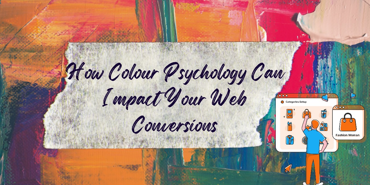
Colours are everything — they’re the reason we perceive things in the world and make decisions.
The same is true for website development and design. Colours hold the power to influence emotions, behaviours, and brand strength.
Any user will interact with your website if they like the colour play and layout of your website (along with other factors, of course!)
If you look at it the other way, understanding colour and design psychology alone can help you elevate your branding, drive sales, and direct website engagement.
Research indicates that individuals form opinions about products within 90 seconds, with 90% of that judgment influenced by colour. Moreover, consistent colour usage can amplify brand recall by 80%.
Keen to upgrade your user experience? Here’s a guide to colour psychology and tips to implement it to boost your conversion rate.
Decoding the Logic Behind Colour Choices
The psychology of color is a nuanced and powerful tool in the realm of web design, shaping user perceptions, emotions, and interactions.
The colour choices employed on a website can significantly impact the user experience and, ultimately, influence their actions.
While some of the knowledge on colours is quite known and easily understood, colour psychology is the art not everyone can master.
Thus, a graphic designer or Top Graphic Design Companies in New Zealand understand this and can incorporate brand-specific colours and designs into your website.
Let’s delve into the intricacies of color psychology and how it translates to user experience.
The Dynamics of Red
Ever wondered why you step into a McDonalds or a Kentucky Fried Chicken even when you’re not hungry? It’s because of the colour red. The color red is a powerhouse that can elevate a person’s heart rate and stimulate quicker breathing.
It encompasses a spectrum of emotions, including lust, excitement, love, energy, but also holds potential negative associations with war, violence, fire, anger, and danger.
When to Use Red:
Red serves as an attention-grabbing accent, injecting excitement into various domains such as food, fashion, entertainment, sports, marketing, advertising, and emergency services.
When to Avoid Red:
While red can be impactful, it’s crucial not to overuse it. Generally unsuitable for luxury goods, nature-themed content, or professional websites and services.
The Radiance of Yellow
Being the brightest color, yellow is linked to competence, happiness, cheer, optimism, and youth. However, it also carries negative associations like cowardice, deceit, and cheapness.
When to Use Yellow:
Bright yellow, used sparingly, can energize and create a sense of happiness. Soft, light yellows are excellent for fostering a calm and happy ambiance. Effective for drawing attention to call-to-action elements.
When to Avoid Yellow:
Exercise caution as too much yellow can be overpowering and strain the eyes. Use it judiciously to avoid a cheap or spammy perception.
The Vibrancy of Orange
Orange, an energetic and vibrant color, conveys a sense of fun, happiness, energy, warmth, ambition, excitement, and enthusiasm. It can also be used to communicate caution.
When to Use Orange:
Ideal for drawing attention to calls-to-action, clearance, sales, or other content requiring emphasis. Effective in industries such as ecommerce, automotive, technology, entertainment, food, and childcare.
When to Avoid Orange:
Similar to red, orange should not be overdone to prevent it from becoming overpowering. Try incorporating softer hues like white to balance intensity.
The Balancing Effect of Green
Green, with its harmonizing and balancing effect, is associated with growth, health, nature, wealth, calmness, masculinity, generosity, fertility, envy, good luck, peace, harmony, support, and energy.
When to Use Green:
Easiest for the eye to process, green creates a relaxing effect and is suitable for representing new beginnings, nature, or wealth.
Well-suited for science, tourism, medicine, human resources, environment, and sustainability. In fact, a Creative Design Agency In New Zealand may recommend you this colour if your business belongs to any of these sectors.
When to Avoid Green:
Less appropriate for luxury goods, tech, or content targeted at adolescent girls.
The Serenity of Blue
Blue is linked to masculinity, competence, quality, calmness, dependability, wisdom, loyalty, strength, productivity, trust, and security. However, certain shades or excessive use can make a website feel uncaring.
When to Use Blue:
Often used by large corporations due to its non-invasive nature and association with dependability. Suitable for healthcare, dental, high-tech, medical, science, government, legal, and utilities.
When to Avoid Blue:
Be cautious with dark shades, as they might create a cold or uncaring ambiance. Blue can also curb appetite, making it less suitable for food-related content.
The Majesty of Purple
Purple, associated with royalty, communicates creativity, imagination, authority, sophistication, power, wealth, prosperity, mystery, wisdom, and respect.
When to Use Purple:
Dark purples evoke luxury, wealth, and power, while light purples are ideal for spring and romance. Well-suited for beauty products, astrology, massage, yoga, healing, spirituality, and content related to adolescent girls and feminine brands.
When to Avoid Purple:
Soothing and calming, purple may not be the best choice for grabbing attention. Darker purples may give a sense of aloofness or distance.
The Earthiness of Brown
Brown, a warm and natural color, is associated with earth, ruggedness, reliability, stability, friendship, and nature.
When to Use Brown:
Stimulates appetite, making it suitable for food-related content. Fits well with real estate, animals, veterinary, and finance. Ideally used for backgrounds.
When to Avoid Brown:
Can be perceived as boring or overly conservative. Not suitable for attention-grabbing elements or call-to-action items.
The Power of Black
Black, a strong color associated with sophistication, elegance, authority, power, sleekness, stability, strength, formality, and intelligence, can also symbolize mystery, evil, and rebellion.
When to Use Black:
Depending on the accompanying colors, black can exude elegance or a modern edge. Many Top Design Agencies in New Zealand recommend black for a slew of luxury products, fashion, marketing, and cosmetics. Anything that gives an enigmatic feel belongs to the colour black.
When to Avoid Black:
Too much black can be overwhelming and feel menacing or evil, making users uncomfortable or afraid. Plus, one can only incorporate contrasting light colours such as white or yellow.
The Purity of White
White is linked to purity, cleanliness, virtue, happiness, sincerity, and safety.
When to Use White:
Ideal for healthcare-related websites and high-tech and science sites. When paired with specific colors, suitable for luxury goods.
When to Avoid White:
Effectiveness depends on the other colors in the design, theoretically making it suitable for any type of website.
The Formality of Grey
Grey is associated with formality, professionalism, sophistication, practicality, timelessness, and strong character.
When to Use Grey:
Perfect for professional websites, luxury goods, or to create a balancing, calming effect.
When to Avoid Grey:
Certain shades may feel dull or detached, making it less ideal for grabbing attention.
The Subtlety of Pink
Pink, a tint of red, carries specific associations beyond its parent color. It represents sophistication, sincerity, romance, and love, without the intense and angry connotations of red. It can be soothing and gentle.
When to Use Pink:
Ideal for feminine products or sites catering specifically to women and young girls.
When to Avoid Pink:
Bright pinks can be overwhelming, while light pinks might feel overly sentimental or sweet for certain sites.
Understanding the psychological nuances of each color empowers designers to make informed decisions that align with the goals and messages of a website.
Striking the right balance, being mindful of cultural associations, and considering the specific context in which colours are used are key factors in leveraging the psychological impact of color for a successful and resonant web design.
Want to make the most of colour themes for your digital interactions? Consult the top Creative Design Agency In New Zealand to set the right colour and design palette that speaks for your brand.
As one of the Top Graphic Design Companies in New Zealand, we can make your website like the perfect spot for your visitors to be on. With that being said, you’ll also secure a good chance of higher conversion rates, given your content, SEO game and CTA’s are on point.